During the last year, we have thoroughly enjoyed this course, as we have learnt a lot and had fun whilst doing it. Together we have planned, researched and produced a music video for the song What I've Done by Linkin Park, and individually we each researched, planned and designed a Digipak and a poster for the album. We are all very happy with our final product's that we put lots of time and effort into producing.
If you would like to see more of our work, we all have individual Blogs, for our work as well as Blogs for our Postmodernism work, research, theories etc, We won't be posting on here any more so if you would like to visit our blogs please click the corresponding links;
I have looked at the Rule of thirds, The image below shows a Rule of Thirds grid applied to Green Day's American Idiot, during my editing of my Digipak in Photoshop.
I will upload my thoughts on Rule of thirds and how and what i've done to apply it to my Digipak/Poster, once I've completed the editing of my Digipak
At the moment our group blog is a bit messed up as we have all been posting on it at the same time and not had chance to keep it tidy, therefore this is why our evaluation and other related stuff extends past the first couple of pages, if you would like to see my evaluation in order one down to four (plus I have post my evaluation part 1 in one post) visit my blog.
I will try to sort out the blog asap, although I may not get time this weekend as I have about 10 pieces of homework to do
I'm going to discuss how my music video, digipak and my advert uses, develops or challenges forms and conventions of real media products.
First of all I will analyse/discuss my Poster.
When I was researching into designs for my poster I didn't just stick to the music industry or my genre of music for inspiration. I have looked at bands and companies such as;
Weezer
Cadbury's
Green Day
Tinchy Stryder
Killers
McDonalds
Hard Rock Cafe
Linkin Park
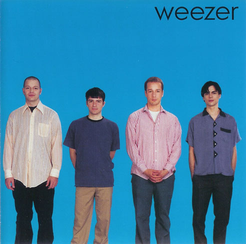
When thinking about designs for the poster, I always wanted to keep it simplistic, similar to conventions rock bands such as Weezer and Green Day use. As well as I assumed that the band would be professional and popular, therefore this allowed me to
be a little more creative in how I advertised them.
As I am a big fan of the band Linkin Park and Green Day, these are two of the first bands that I looked at for inspiration, the posters that I liked the most are the following;
These two posters attracted my attention for a couple of reasons, first they are very eye catching for their individual reasons, the one on the right because of it's bright colour and Billie Joe Armstrong in a similar position to the Statue of Liberty in New York, and because it's the same picture they used on the design of their 'Bullet in a Bible' Digipak. The second one it's very simplistic, although this isn't an advert it is just a poster which relates to the 'American Idiot' album, but they have made it very simplistic and gone with the same wording and picture as they did with the album art on the corresponding album.
As for the Linkin Park advert they as well have used the picture from their album Meteora, once digging deeper into the adverts of this genre it turns out that it's common to use the album's front cover in the albums advert. This is another convention that I wanted to use as it is effective because when people see the advert they'll remember it as the bands new album, then when they look online or in shops for music to purchase they'll spot the image and recognise it as the bands new album, instead of just scrolling though new albums and not paying attention to it.
I wanted to keep it simplistic, e.g. put as little wording and pictures on it as possible but make sure that the viewer recognised it as HW's ERA, Therefore I along with the wording "NEW album released 21/1/11, Pre order on iTunes", and the bands logo, I believed this was necessary information to the readers, other famous companies and artists using this method include Tinchy Stryder, McDonalds, Cadbury, Hard Rock Cafe and Coke. The following adverts which are examples of the same companies using this type of advertisements. This is evidence to support my belief that you don't need to say a lot to get the message across. This is why on my poster I only wrote "New album released 21/1/11, pre order on iTunes" along with the bands' logo and the image from the front cover of the digipak. These three items allow for recognition of the 'brand' that HW's ERA is, I believe this works because modern artists and bands are now 'brands' to themselves and their record labels such as Dairy Milk is to Cadburys, therefore when you are shown the LP logo you would recognise it as Linkin Park's logo same for the double F logo of Foo Fighters, or a band/artist that you like. This works because of their brand awareness and brand loyalty, although they would like to capture new people into their audience all the time, the fact is within support from their genre of music or market they are normally already known and are popular therefore they can afford to use this type of advertisement and be successful with it.
I decided that I would challenge the convention of using advertisements on my advert, as I wanted to keep with the simplicity of my design, and adding more text and logos from other mediums such as NME and Kerrang wouldn't help keep it simplistic, although the band could have benefited from Synergy marketing, I believed that my poster/advert would be more successful by keeping it simplistic.
My Final piece of inspiration for both of my ancillary products was Weezer, but when it came to my poster I looked at the 'Green Album' poster (doesn't include white and black border), although they have used more text than I was looking to use they have just adapted their album cover, by adding text underneath it, the original album art. The main text that is easily readable without much acknowledgement, which posters/adverts don't normally get, says "Weezer" "the green album" "out now". I decided to use their conventions of using their digipak's front cover picture on the poster then adapt it to their needs this is why the band logo is there I decided that I need to write "HW's ERA" due to brand awareness and but I evaluated on their "out now" part and wrote that you could "pre order now from iTunes" and when the release date was.
Digipak
My digipak has taken inspiration from many places and many different artists; some include
Weezer
Green Day
Blur
Foo Fighters
Linkin Park
As I researched I found out that most album art / digipaks aren't original they are just copies from previous artists, for example the two following pictures, but this doesn't mean that I didn't want to be original in the methods that I designed my digipak, although for my front cover I took the inspiration from Weezer's ablums, they didn't actually come up with their designs by themselves they actually copied another band called (N2S: insert band name), Which actually weezer actually copied for their blue album, as using the 'blue album', the 'red album' and the green album that was produced by Weezer for inspiration, I decided that I wanted to make mine similar to their, when designing my front cover I wanted to blend and change their album to create mine, l this is why I have the four band members standing in a jaggered style one infront of another but spread out, then placed in the bottom right corner of the album, as you can see the jaggered postion that I used came from both of the red and green albums and the long/full shot of them came from the blue album. I also had them stand in different ways such as Weezer does in each album, I have them either with either their hands in pockets, arms folded or by there sides. and when it came to the time and explicit content sticker, I decided that unlike any of Weezers albums I wanted to break the convention of either having it in the centre or to the right and feature it on the left, in a bid to be original. The same is true for my inside page where the band members are sitting/standing to the right hand side under the albums name.
Although I produced a Digipak for a rock band, I challenged the convention of rock albums, as rock is known for it's use blacks and other dark colours, I decided that I didn't want to use any dark colours particularly, as I believed that I could make a Digipak for a rock band that didn't follow the convention of using dark colours, there for I used red, blue, green, white and yellow, although the majority is either red and white, I wanted to use this so that it stuck out and was eye catching.
I took inspiration from Green Day's American Idiot for my back cover, if you look at the album art below you can see that they featured a hand holding a hand grenade in the shape of a heart, which was leaking blood on the front cover and on the back they had a picture of the pin. I decided I wanted to take inspiration from this and adjust it to have just the band's logo (a grenade, with the letters HW carved into it) and place it in the top right and corner with the text flowing tightly around it. This is another convention that I broke because whilst researching I didn't find a back cover with text tightly wrapped around a logo/picture. Although I decided that I wanted to go with my original idea and produce the back cover with the text tightly wrapped around a image.
When designing my ancillary products I took into consideration the rule of thirds, which meant that using Photoshop I put a grid on my photo which basically put 3x3 square grid on my picture this then allowed me to align my pictures to the rule of thirds, therefore having my main sections of the images at the most eye catching section of the picture, as the eyes don't naturally look straight to the centre of a picture, I placed all of my pictures except for the CD design and CD case section in the most eye catching positions, to make sure that my image was eye catching as well as easy and natural to look to at the points of interest such as the grenade on the back cover or the lead singer and guitarist on the front cover. All of the points of interest on my poster and album art have been applied to the rule of thirds, Therefore the points are appear in the picture where the 'imaginary grid lines' would cross each other, these lines and crosses on the lines are where it is easy and natural to see.
Normally the singer is the centre of attention and main person the public recognise when you talk about any band not just a rock band but I decided that I wanted to challenge the convention and place the Guitarist at the centre of attention with the drummer and lead singer in equal positions behind him followed by the keyboard player, This is unusual for any band as by default, with the exception of a couple of bands such as Fall Out Boy the lead singer is the centre of attention, e.g. Dave Grohl in Foo Fighters, Hayley Williams in Paramore, but with bands who break/challenge the convention the guitarist or drummer are the centre of attention such as Pete Wentz(guitarist) out of Fall Out Boy or Phil Collins(drummer) from Genesis.
I have been inspired by Blur's "Best of:" album which was designed by Andy Warhole the famous artist, this is why I decided to do some research into art and him, whilst looking at designing my ancillary products. although originally I wanted to feature this kind of theme throughout my entire digipak, I decided against it. I did feature a copy of his blur album front cover on my digipak, it was the section where the CD would slip behind, I also wanted the CD to have the same design on it. I can only find/think of two rock band artists who use art on their album cover Green Day and Blur, therefore I wanted challenge the convention and put some 'art' in side of my digipak.
Music Video
Throughout our music video we have used and challenged conventions which are used in real media products, these conventions are;
Using Posters,
Band Logos
Band finishing Performance
Use of colours
Band members Clothing
Filming Inside
Firstly we decided that we should put the band's logo on the drum kit, for two reasons, this is what almost all bands do, but also because we believed that it would look good, which I believe it does, I actually think that although it's the same colour as the drum and the brand of the drum, it stands out.
Band members clothing, we tried to keep the band members clothing as close to what professional bands wear, such as black skinny/slim fit jeans, skater shoes/hi-tops and either a shirts or t-shirts with a statement or a design/pattern on it. Foo Fighters and Green Day are the two major bands that we based our clothing on. If you look at Billie Joe (lead singer from Green Day) and Tre Cool (Drummer from Green Day) they are wearing a black shirt, such as the one that of our drummer Rhys is wearing, although he has his sleeves rolled up, for two reasons he look better with the sleeves rolled up as prior his appearance didn't seem to quite fit the image of a rock band, and as being the drummer he needed to be able to easily move around whilst playing the drums at a high tempo, such as he does in our video.
Also for our keyboard player we wanted to challenge the convention of them being the people who wear 'normal' clothes, although as they are behind a keyboard you don't normally see their shoes/trousers as they aren't normally featured much especially in comparison to drummers, guitarist, singer and even the DJ on his decks (What I've Done music video), but we decided that we wanted Tom (keyboards) to wear a vest t-shirt but also some fingerless gloves as they allowed us to put across the image of him being a major part of our rock band unlike most keyboard players who are mainly support members of the band.
The following video displays the drummer, leader singer/guitarist and bassist wearing the same style of clothing that we decided to go with, This includes the Shirt and Vest, and the shoes.
The lead singer and the guitarist was wearing different style of clothing which reflected more to the style that is featured in Foo Fighters' "The Pretender". They both wear skinny/slim fit black jeans and a T- Shirt with a picture/Statement on them, although Darren our lead singer wears hi-tops and Dave who is the Guitarist wears a scarf and skater shoes.
We got inspiration for filming inside from the music video which is produced by Foo Fighters their song is called Monkey Wrench, Green Day's Basket Case, Paramore's Ignoracne and All American Rejects' Gives You Hell. When I was researching into music videos, I looked at loads of artists including ones I like and don't but my inspiration came from four bands that I like, although not on purpose.
All four of the bands previously mentioned use the convention of filming their band performance inside, I liked this idea, as it allowed us to do a variety of things, customise the mes en scene easily in comparison to filming out side where it would be very difficult. I like the idea of making it look as if we in our band's studio either recording or practising their song, although this isn't a widely followed convention it is still quite popular among music videos especially rock music, as exampled by the bands and videos (listed and below), Although I liked the idea of filming inside, if filmed somewhere inside else and without the posters, I don't think I would have liked it as much, because although we did film inside, we wanted it to be slightly different and not film in a house/flat such as the ones listed.
Posters
Whilst researching music video for inspiration, I watched a video from one of my favourite bands the Red Hot Chili Peppers' in their video for Dani California they pay homage to their favourite bands/artists, by dressing up/acting like they do/did, This is the similar for All Time Low in their music
video, although they don't necessarily pay homage to their favourite bands but have text in their video saying phrases such as "more like All Time Blow", instead of All Time Low and "I'd rather be watching Fall Out Boy" . These are two different types of rock music and music video's but the wording and the bands paying homage to their favourite bands/artists such as Elvis Presley, Blink 182 and Guns n' Roses. All though we knew that we wanted some thing in the background such as posters, we wasn't sure about it but after researching and see in these two music video's and a suggestion, we decided that it would be a good idea to put posters on the wall of our favourite bands, (Green Day, Foo Fighters, 30 Seconds To Mars and My Chemical Romance, unfortunately we could get a hold of a Linkin Park poster for the day of the production).
We decided to challenge the convention of having no posters in music videos but at the same time we wanted our posters to pay tribute to our favourite band.
Our music video shows members of the band finishing their performance, this is a convention that is used by numerous bands, a good example the following videos are by Green Day and My Chemical Romance.
By doing this in our music video it allowed us to emphasise that the band members were only interested in playing the music, enjoying themselves, 'relaxing' and having fun, as most bands start out as a hobby and out of enjoyment they keep practising, The very last section of our music video as demoed below, I think that the music video and this shot explains and shows that they were only interested in playing their music, this is why they have a quick set up sequence of shots and we didn't use an establishing shot in the video.
(last 15-20seconds-tubechop wouldn't allow me to cut this clip)
(last 15 seconds-tubechop wouldn't allow me to cut this clip)
It is quite often that rock bands use little colour, take the My Chemical Romance video for "Welcome To The Black Parade". We decided that the use of a colour would make our video look better, we had discussed about make our music video entirely greyscale/black and white, we even discussed which method would be best e.g. filming in colour then converting to black and white or filming with our surroundings being black and white, we even discussed maybe only us being colour and surroundings and props being greyscale but decided that filming in full colour be more effective. Also by doing this we would challenge the convention of using lots of colour, which isn't often used in the music genre our song is associated with. we also decided that we wanted to make it very bright whilst inside and then for it to be very dark when the band finish performing and leave, we discussed the opposites of brightness and darkness contrasting as rock music is associated with darkness and rebels, etc but the band are performing in a very bright conditions and then leaving to go into darkness, the stereotypical view of rock bands are that they they prefer darkness, but our music video allows us to challenge this convention.
unfortunately you won't be able to view my work at school due to their restrictions with Dropbox, which is the method I have chosen to be able to get my flash animation on my blog.
from Nick
This prezi document shows the main music video that we used ideas from and put them into our as you can see the main bands that we got ideas from was mainly Foofighter and Green day. each one of the description contains the video so that you are able to see where I got the idea from.
From my planning and research I feel that we have used a lot of ideas from various artist such as green Day because our final video seems to be similar to the American idiot video in the way that it has no narrative just the band preforming which is what we decided to do because our draft failed so we were advised to just do a performance.
This Tube chop shows some of the elements that we tries to use in our video for example they start jumping around and when we filmed I tried to get the band to jump around so that the seem more like rock star because that was one of the issues with our draft, also anther key element from this clip is the band logo on the drum set which we also used in ours as shown in the image below.
This image shows the similarities from our music video and the clip because as you can see we used the idea of using our logo on the drum set as Green day have in their video American idiot.
This clip from Green day wake me when September comes also seem to have the logo on the drum kit which again shows were we got our inspiration from because it seems to be a common aspect in most of their videos, which again shows that having the band logo on the drum kit works well as we were not sure to begin with.
I think that we also used part of this video with the way we set up our video because in our video the cables for the guitar and and amp were on some of the shots which is similar to the Green day clip above, the reason we did is that it makes the video look more real because you obviousally would need the cables for most rock video in order to get the sound, at first we were not sure whether it looked like we did not think about mise en sense but having watched the Green Day video it seems to work so we decided to keep it in our because it gave a sense of realism. Other elements that we used for our video that we used from this clip is the way the drummer is sitting down and does not get up because we thought that if he was to stand up it would not look right and that there was not enough room for him to do so.
This clip by Foofighter is similar to our because of the location however our is a more confined space but the main inspiration that we used was the mise en sense which is bland really like in this clip because every thing seems to be just white, which works well which is what we have tired to so but we have put poster in the background where as they have just put a red screen which again works.
This video from Greenday performing lie we have have tried to use is the way the drummer has headphones when he is playing the drums because our drummer Rhys has very similar headphones as the drummer from Green day. The reason we used this ideas was because we thought they looked good on him and that he then looked like a proper drummer.
This clip of Foofighters Monkey Rench for some reason does not work for some reason but it you view it on youtube it works the section that we decided to try and use in our video is the location of the band performing in small and confined place which is very similar to our video because ours is small and confined because most shot you can see the whole room which is like the clip above.
This clip of Foofighters best of you again does not work on tube chop for some reason however it works on yourube, In the clip you can see that the lead singer Dave Groll is singing into the micro phone and is very close to it which we have tried to do the same in our video because we really like the idea of having close ups of him and the microphone.
Our final music video as shown above has used many of the aspects and ideas from the exciting bands as shown above unfortuneatlly our video does not work on tube chop so I have not managed to show each clip with relevant part to match with the excisting videos so I have just put the whole video and from it you can see how we have incorporated bits from the above videos.
This presentation shows the main area that have been carried on through out our video and our ancillary products it also includes images as evidence. I have also explained each section and the reason for why I have used these aspects.
The two images bellow are two of my initial ideas for the album front cover which the end I did not use because after reviewing it I found that it did not work as it just had too much going on.
This image was the original image that I was going to sue but after asking my target audience they said that they did not like it because there was just to much going on and looks to complicated and they said that it needed to be less active and focus on one particular part.
This image is the same as the above one except on this one I made the four band members in the middle carton like by adding an effect on photo shop, ufortunatly I had already made the alteration before I asked my audience, and they also said this one was rubbish and not very good however the cartoon effect was better that the characters with no effect, but still was poor and did not work.
This is the third front cover that I changed as a possible option for my original front cover the alteration that I made to this that I turned it all into black and white which I got the ideas from my research into linkin park as they seem to use black and white in many of the products, however I had already made this before I had asked my audience and as like the two above they did not like the whole idea they thought the black and white was not too bad but the actual content did not work.
Having listened to my audience feedback I decided to scrap the above ideas and decided that I need to create something more simple to do this I looked into front covers that I liked and basically copy it and then adding my own photos and colours. I decide that I want my colour them to be black and white so that it is similar to Linkin Park, I also choose it because many front covers that I liked used black and white such as.
Linkin park
Carruretors
West life ( Liked one of their album cover similar to my final product)
This image is my final Album front cover that I used as you can see I tried to replicate the Blur album cover as it was suggested to me by my audience and also that the fact that I really like it as well the changes made is that I changed it to black and white as shown above.
This is the Blur album cover that I replicated and as you can see I have used my own images to try and create the same idea.
The second album cover that I used to help me with my inspiration was the Westlife album cover you may think this is strange choice to use as they are not rock band but more of pop band however their album I really like and it has many of the same features as the Blur cover in the way it is layout and has all four band members in each corner.
As you can see form the image it is very similar to the Blur cover , however the main reason I like it is because it is in black and white which is what I was hopping to achieve with mine as at first I was unsure whether the idea would work but now I am able to see and existing idea that works which gave me the confidence that could work. I also used this cover as my main inspiration, however I decided that having the title at the top may not work so decided not to have it as I thought the Blur one looked better so have not put the title on mine.
The Scribd document shows the process that I went through when deciding on my album front cover because i found this the hardest part of the Dig-pack because it probably the most import aspect of it because it is the first thing that stands out at the person looking at the product so it needs to be eye-catching and want to make them look in side. And as you will see in the document it shows my first idea and then where i went from their until I reached the final product the document explains why I had choose each idea and what the good and bad points were and also what the teacher thought.
evlation medaia question 2
For some reason the document layout seems to be wrong because some of the pictures seem to be overlapping the righting and the arrows are not where they should be however the actual document seems to be fine, however once I put it onto Scribd it seems to alter it I played around with the word document and then re uploaded it but it just does the same so I am not sure why.
For my Digi pack I got a lot of my inspiration from verity of sources and artist I tried to keep the colours of the digipack similar to the linkin Park colour which seem to black and white I looked in to a verity of Rock bands and other groups such as: For each of the following I it will explain which part I used from them and why.
This is an Animoto presentation that I created on Animoto it shows my digipack that I created as part of my music video, as you can see my digipack has carried on the black and white theme because I wanted to try and be as consistent as possible and I also wanted it to follow my research because it mainly has black and white theme. In this video I have also used some bright colours such as red on a few of the titles and the the colours on the band members clothing however I have faded the images as shown in the images with the inside left and right.
This prezi presentations shows the seven main pieces of constructive feedback from our audience, I have decided to use this as it clearly shows what our audience thought and made it easier for us to understand what we needed to change because the piece of paper that shows the feedback was not very clear to read in certain sections. The presentations shows the draft video which when we looked back at it we cold all see that the feedback given was fairly accurate which made it easier for us to know how to improve the final product.
The clips below backs up the audience feedback we got which was the narrative does not work because it make no sense and looks terrible and it has the white section which does not work either. The other clips below show area in our draft video that match up with what our audience gave us as feedback. All the clips below I created on tube chop by cutting the bits that I thought best matched what the audience feedback said and I have then reviewed each clip and said why the clip does not work.
Feedback number 1 Narrative does not work
The clip below shows the beginning of our video which as you will see the narrative does not work very well because it does not make sense and does not really relate to the song because we see the male actor get slapped and he shouts and walks out, and the female goes in the other room and turns on the TV which I think does not work out and needed to be changed, which is why I think the audience feed back said it is to complicated and that it does not fit.
This is the second bit of narriative which is the next clip below. I felt really backs up how bad the narrative was because as it goes on you can see that it still carries on to make no sense and becomes worse because the male actor walks out side and while the female looks through the window and it does not seem to link together very well and is very confusing for any audiences, watching it.
The clip below again shows how bad the narrative of the video is because the whole entire section is not put together well at all the lighting is very poor this was due to us running out of time which meant he had to film with what we had. The other part of the narraivtive too dark and is far to complex and made no sense to an audience however at the time it made sense to me as the director, but watching it back I can see why our audience feedback said what they did because I agree with them so in the final video we must take more time planning the shoot and think about things like lighting and the mise en sense which was very poor indeed. The reason I have shown three clips is because as the video was split into two section performance and narrative and was cutting between the two so it was difficult to get just the narrative as is was split up so I have done three clips which help demonstrate the question better as if the clip had performance it would be irrelevant.
Feedback number 2 Avoid waling it is very boring
The feedback said that the band needed to avoid waling which they do at the beginning and it is boring and takes to long the clip below shows this, as you can see it takes forever for band to get ready. The comments suggest that it is very boring for the audience to watch and takes up to much time because it takes like about thirty seconds just to walk to the location with no music so for audience member it is very long and necessary because it is not really important and with their being no music it is even more dull to watch.
Feedback number 3 Completely re film because it is shocking
The clip below shows that our audience thought we need to completely re film and I agree because the whole video just did not work especially the narrative because it made no sense the mise sense was poor and had little thought put into it which was demonstrated in the video. The worst part of it was the out side narrative which failed in every way because it was too dark which made it very difficult to work out what was happening. The performance side of the video was not so bad as the narrative but was poor as well, because the shots used were not the best and they needed to be closer to the band because as you will see their seems to be too many long shots and not enough close ups which is one of the main conventions of a music video.
Feedback number 4 Mise en sense is crap and no thought
The mise en sense in the draft video was shocking as shown in the in the clip below because looking back at it I can see that not enough thought was put into it because you can see the location for the narrative just looked like a standard house which had just been filmed in and no thought about what set would need to look like in order for it look good and be a success. For example the performance looked like a beer garden however as you can see it is a beer garden but their is not effort put into making it not look like one for example the shot of Darren where you can see the playground, I just think some of shot needed to be framed better to avoid showing to much of the garden.
Feedback question number 5 Need to sing more looks fake
As you can see the video clip shows that the singing was poor and we need to sing more because when you watch the clip you can see that they are not really singing and that the lip sinking is out place and when it is it just looks fake and not effort has been put in really I think that it is because they did not sing for real which then looked poor when filmed. I agree with audience and I feel that we have learnt that we need sing for real and really sing in order for it to look realistic because the clip below shows no sign of this so we have leant that we will need to sing for real.
Feedback question 6 The band need to play the instruments
The clip shows that the band needs to play the instruments more because in the video their does not seem to be much playing of the instruments which does not look very good because the convention of a rock music video is that the band plays the instruments they have where in ours their is a lack of this which also makes the video a bit boring because you expect to have them played a lot. However their is parts when Rhys plays the drums well but it is not long enough and the same with Nick on the guitar, so on final we should spend less time on waling and get into it which means the instruments will be shown more
Feedback question 7 Need to show more attitude meant to be a rock band
The three clips below shows the lack of attitude from the band because as you can see they all seem like they don't want to be there especially Rhys who looks depressed and is not putting much effort into drumming it seems like he is just tapping the drums instead of whacking them like a real drummer would. The clips also shows lack of attitude from Nick as well because he seems to just be looking down at the guitar and just playing it causally where as he needs to strumming it as fat as he can and be jumping up and down like a real guitarist because he also looks like he does want to be their. However I think that out of the three of them Darren was putting the most effort in and looked the most like a rock star however he was not great either because he could of jumped around more instead of staying in one spot and tapping his feet
The clip below shows different parts of band preforming and as you can see through out they all seem to lack attitude like proper rock stars like I said before they seem to lack it and in the final we need to make sure they all have more attitude because they look nothing like a rock band.
The clip below is anther section of the video in which you can see that the band lacks attitude and motivations and enjoyments because they all seem to be unhappy and looks like they just want to get it over with and don't want to be there.
The reason I have done three clips for the same question is because as the performance and narrative are split up and keep jumping between each other so it would be difficult to just have one clip because then you would end up with narrative sections which are irrelevant so have picked out key bit to demonstrate it better.
To help me complete question number 4 of the evaluation which was how we used media technolgies to help us in the planning and construction and evaluation stage. To answer the question I am going to use software called Cam studio which a recording software that basically print screens every thing that you do on the screen, so I will record me using the software and then edited all and then put it on Youtube. I used the software for ICT interactive media Unit so I am familiar with how it works. The clip that I am going to create will have commentary which will explain every that appears on the screen so that you know what I am talking about.
This is an image of cam studio it is very easy to use because it has a couple of button which are stop and record so it is very easy to use.
The two clip below show the technologies that I used during the project however I have has to make two clips because the whole video is too long and wont let me upload it onto youtube so I have had to split it into two sections so that all the content is able to be viewed.
Part one of video demonstrating technology used
This your tube video shows and explains all the different technologies that I used during the planning research construction and evaluation for example:
Blogger
Youtube
Flickr
Prezi
Animoto
Slide share
Tube chop
Each one of those technologies is explained with screen shots of how to use them and then also a commentary by me telling you how I used them in my work.
Scribe
Yo window
MSN
Bubbl
Photoshop
Equipment used
ACER Laptop
I used this laptop during the course work as it is the same model as my computer which I used to most of the work on because I really used the school computers because they were pretty poor and did not have all the relevant software that I needed I also used it because it meant that I did not have to transfer data between two computer I could just use my computer, which saved me a lot of time as a result.
I also used my own computer because I have photos CS2 which I needed especially for my Digipack and the photo shop that the school had was not as good and i was never able to get onto them as they were always full.
Cam corder
To film both drafts of our video used our own camcorders, mine and Darren's the reason we used our own was because the ones from school were not as good as our and we had book them in advance which was a pain and l also we were able to use it for a few days before returning them. Whereas with our own we were able to film when ever we wanted, which gave us the freedom of when to film. also by suing our own it meant that we did not have to use the school MACS which are shocking because they only allow you to edit footage from mini DV camcorders.
Digital camera
I used my own fuji digital camera because it was able to use it when ever I wanted and allowed me to have the freedom of taking pictures when ever I wanted I used the camera to take loads of pictures which I then uploaded to Youtube I took photos of various location because I wanted to have a verity of locations which we as a group could then choose from. I also used my camera to take photos for the digipack my camera was very useful for this because it is almost like a digital SLR which meant it was more suitable than a standard camera which the college had. The reason I did not use the school was because one they were very good and two we only got to borrow them for a few day so by using my own it was more freedom to work with.
Tripod
When filming and taking pictures for the digipack I used my own Tripod because it was easy to use and I was able to access when ever I wanted instead of borrowing the college which were worse than mine and would mean that I would have to carry the tripod with me during school hours and would have to return it after a few days, so by using my own it meant I could film when ever we choose because we would have equipment with us.
Sony Vegas Pro
To edit our video as a group we decided to use Sony Vegas PRO because it a unprofessional editing suite which meant it had all the necessary features that we wanted in order to make our video a success, we also used it because Darren had the software which meant that we could edit of school hours giving us more time to edit. The main reason we used Vegas was because I-MO VIE on the E-MACS at school were terrible and we could never get on them as their was only five for the whole media department which made it difficult to use them so by using Vegas we had no issues about using it when we wanted.
Shot 1
1. In the first 5 seconds of our video there are shots of all of the band members getting ready to perform the song and this is quite common in music videos as it is one of the conventions that are in music videos, showing the audience the band getting ready by plugging in. One of the first people that we see is the drummer putting on the headphones and getting ready for the drum coverage, this could show that he enjoys playing the drums as he is quick and eager to get going.
Although this technique is very common in music video, i have looked at an existing example in the rock genre of music for an opening scene and this scene is from Green Day and the song is called Basket case:
shot 2
2. In this series of shots there is a shot of the band logo that is placed on the drums and this is a convention that is in all rock band music videos as it shows the audience who the band is and it is also a little form of identity. The logo is located on the drums as this is the most common place to put the logo and it is also most easily seen as the drums stand out in the background. I have also included some close ups of the logo on the drum set to allow the audience to focus on the logo.
this technique is very common in rock videos as it allows them to spread their band name and identity around all of the audiences, below is an example from The Big Pink, performing Dominoes:
shot 3
3. In this shot there is a high angle shot to show that the main singer is in charge and to emphasise that he is a big powerful person and this is a different to all of the other people in the band as the shots of them are mostly level and they are only high angle shots if they are in charge, this is another rock music video convention that I have followed as it shows the audience who is the main artist in the band and that he / she is the most important person in the band.
this is used by most music video to show, power and the main person who is in the band, below there is a clip from ACDC Black In Black showing the high angle shot:
shot 4
4. In the video there is not an establishing shot, but this emphasises that the band just want to get on and start to play the song as they do not mess around and this shows that they have a passion for rock ‘n’ rolling, this is a convention for rock music as it is more focused on the stars and the playing of the instruments so there is no need for the narrative. The location of this video is obvious although there is not an establishing shot as the background is covered all wood and the most common wood building is either a shed or a log cabin and this is where the band performs the songs and it is just for making music, this is another convention as the location is given away without an establishing shot so therefore there is no need for one. Although this is not the most commonly noticed way of performing rock music it is still used as there is a dedicated room instead of a stage with thousands of people.
most of the rock bands do not have any introductions to them as they mainly all start straight off with the music and an example of this would be Paramore performing Misery Business:
shot 5
5. Another way of showing that the band likes to play the music is shown as they are seeming to enjoy playing the song, this is because they are all showing their enthusiasm when they are bobbing up and down and dancing with the music, this is a convention that is used by all of the existing rock bands as it shows a passion that they have in playing the song and that nothing can take it from them.
all of the rock bands that are in music videos show a passion for performing and playing their instruments ect... and this is shown by enthusiasm, jumping, dancing and so on... an example of this would be the Foo Fighters performing the Pretender:
shot 6
6. When we received our feedback of our group video, we were told that our narrative was not clear at all and that we had too many long shots, this meant that we would need to rethink about our storyboard and we also decided to choose a different location as the location that was previously chosen was not suitable for the genre of music that we had and finally we removed all of the narrative as this was the easiest and quickest option that we had, this meant that the conventions that we had broken e.g. the location and the narrative were corrected as we were then in a room for just performing and there was only performance in the video and this is a common rock video convention
some of the music videos have no narrative and this is mainly in the rock genre as it is about the instruments that are being played, and an example of this would be My Chemicle Romance performing Welcome To The Black Parade
shot 7
7. Our music video has narrative that applies to it as we have proven some of the theories that the theorists have made and one of the theories that our video has proven is by Sven E Carlson and his theory is that all music videos either have: performance, narrative or both in and the video that we have produced is all performance based, so this proves that Sven is correct, another theorist that we have proved to be correct is John and his theory is that a music video is like an advert a there are lots of close ups of the singer and band logo
Convention that I have applied / broken for the music video:
in our final version of the music video I have applied all of the conventions with Damon and Nick and these are all here to follow what conventions make a rock music video and I will be listing what convention that I have applied and what I have broken in our music video below:
1. All of the music video is performance - For this I have altered the draft video storyboard so that the video is only performance
2. The performance is more aimed at the band either playing in an urban area with lots of straight lines and sharp edges in the background or they are performing at a concert to thousands of people - For the setting I have used my shed as it has many sharp edges, with lots of straight lines and this is following the convention
3. There is a band logo on the drums or somewhere else in the video - For this I have applied the band logo that I have created into the video by applying it onto the base skin of the drum
4. the location and the props have to fit in with rock - For this I have set the video in my shed and have also put some posters in the background and this following the convention as they are all fit in with the genre of music, also i have used all of my instruments for the band and these are all instruments to do with rock music and they all follow the convention.
5. the lighting has to be dark in the background - I have broken this convention as the song that we were making a video for was more of an alternative rock song and this is light rock, so therefore I decided to use a lighter setting to emphasise the more gentle side of this music
6. all of the colours that are used are dark and deep - For this I have only applied dark and deep colours for the bands clothing and the props such as the instruments. And I have broken this convention by using a lit up room where the background is a very light, bright brown shade of wood. this combination of colours being dark and dull to bright and light shows that the video is not a rock song or video, but it is an alternative rock video
Digipak
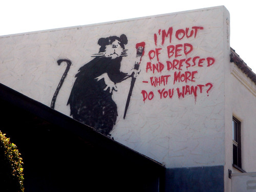
In my digipak I have made an effect that makes the images look like they were made by Banksy and this is an artist that goes around doing street art also known as graffiti. As the song that we were doing was of the rock genre I thought that it was appropriate that I make a digipak that was based on graffiti as this shows that there is a lot of miss behaviour and this is shown a lot in most of the rock bands e.g. Green Day
I chose to follow all of the conventions of a rock CD album apart from using dark colours as there is a building with bright brick walls in a street that I have broken this convention because I used the brick wall to show the audience that it is some sort of graffiti in the streets as there is a bright coloured building in the shot, I then followed all of the other conventions that almost all of the digipaks are formed around
My digipak design was inspired by the images of Banksy’s artwork on street buildings that is further through the blog and they are images of the grim reaper, child with umbrella, monkey in a suit and a rat on a building painting (I got my main idea for the digipak cover from the rat painting of banksias work) here is a link to the picture of my inspirationhttp://farm1.static.flickr.com/86/232486050_5e9f669df8.jpg , other inspiration I hade was: Banksy art, graffiti, urban art and streets, from all of these inspirations I set out to make my digipak
I have used all of the shots in the digipak of the band and then there is a page for each of the band members and on them pages there is a list of their stats and this was inspired from the playing card game called top trumps and this was used in my digipack e.g. guitar skills: 8
I then had a page where there was a little information of the band and this was a single column that briefly described the band
Convention that I have applied / broken for the Digipak:
For my final version of the digipak I have followed the conventions for a rock digipak and here are what conventions that I have followed / broken:
1. the lead singer is the centre of attention - For this I have used a Banksy style of street art and I have positioned it so that it looks like the main singer (me) is painting the rest of the band on the wall although the main singer is a painting on the wall.
2. the colours that are used are dark and dull - For this I have edited the pictures so that they look like graffiti and that the colours they are is black and white, then the background is a picture of a brick wall and road.
3. the font of the text must suit the genre of music - For this I have used the font "Chiller" and this is a graffiti looking font so it fits in with the theme of the digipak, also it fits in with the genre of music because rock has a miss behaving effect to it, and miss behaving now is mainly graffiti
4. usually set at night time or in the streets - For this I have set the pictures in the streets as there is a brick wall just off the road and this is a street, although I have not set it at night time, because this would of effected the quality of the picture and it would be harder to see the text and images.
Poster
I have followed the effect that I have used for my digipak for my poster design and this is to make the effect that Banksy painted it on a wall, in this design I have included a series of the logo that are being carried by the main singer of the band and the inspiration for this design came from the image of three people with TV’s as their heads and here is a link to that picture: http://wallpampers.com/pictures/2679/Banksy-Banksy%20Urban%20Eyes.jpg , as the three people had the same head this gave me an idea to use a similar design but the people are carrying the objects instead of them being attached to them selves
I chose to break the convention of there being reviews on the poster as I thought that they would not be needed as they are just showing what somebody thinks of the new album and that people have different tastes to what they like e.g. rock, jazz ect... and therefore I decided not to use them
My poster design was inspired by the green day poster that is further through the blog and this is a drawing of a man walking, other inspiration I had was: Banksy art, graffiti, urban art and streets, from all of these inspirations I set out to make my digipak and poster
The text font idea that I have used in my poster design came from the image in the link: http://www.wallpaperbase.com/wallpapers/photography/graffiti/graffiti_3.jpg , as you can see in the image the font sticks out and it is quite hard to read at first, but then it becomes clear and this is the effect that I was aiming towards as it distorts the audience and it also follows the theme that I was aiming for of street graffiti/banksy effect.
Convention that I have applied / broken for the poster:
for my final version of my poster Ihave followed the conventions for a rock poster and here are what conventions that I have followed / broken:
1. the band logo is on the poster - For this I have applied four pictures of the logo being held by the main singer and all of this is in a Banksy style of art
2. the colours are dark and dull - For this I have used black and white for the images on the wall and there is then brighter colours in the background as there is brick work and reflections of the sky
3. the font must be easy to read - For this I don't think that the band name and album name is clear as it is supposed to be graffiti, therefore I have broken this convention to make the text follow suit with all of the graffiti pictures on the wall


-front.jpg)


